
Making Greenvelope’s website and app easier to use and more visually polished for sending digital invitations.
Greenvelope is a digital invitation platform that helps users create, send, and track online invitations for events like weddings, birthdays, and corporate gatherings. The product aims to deliver the charm of traditional invitations with the convenience of modern technology.
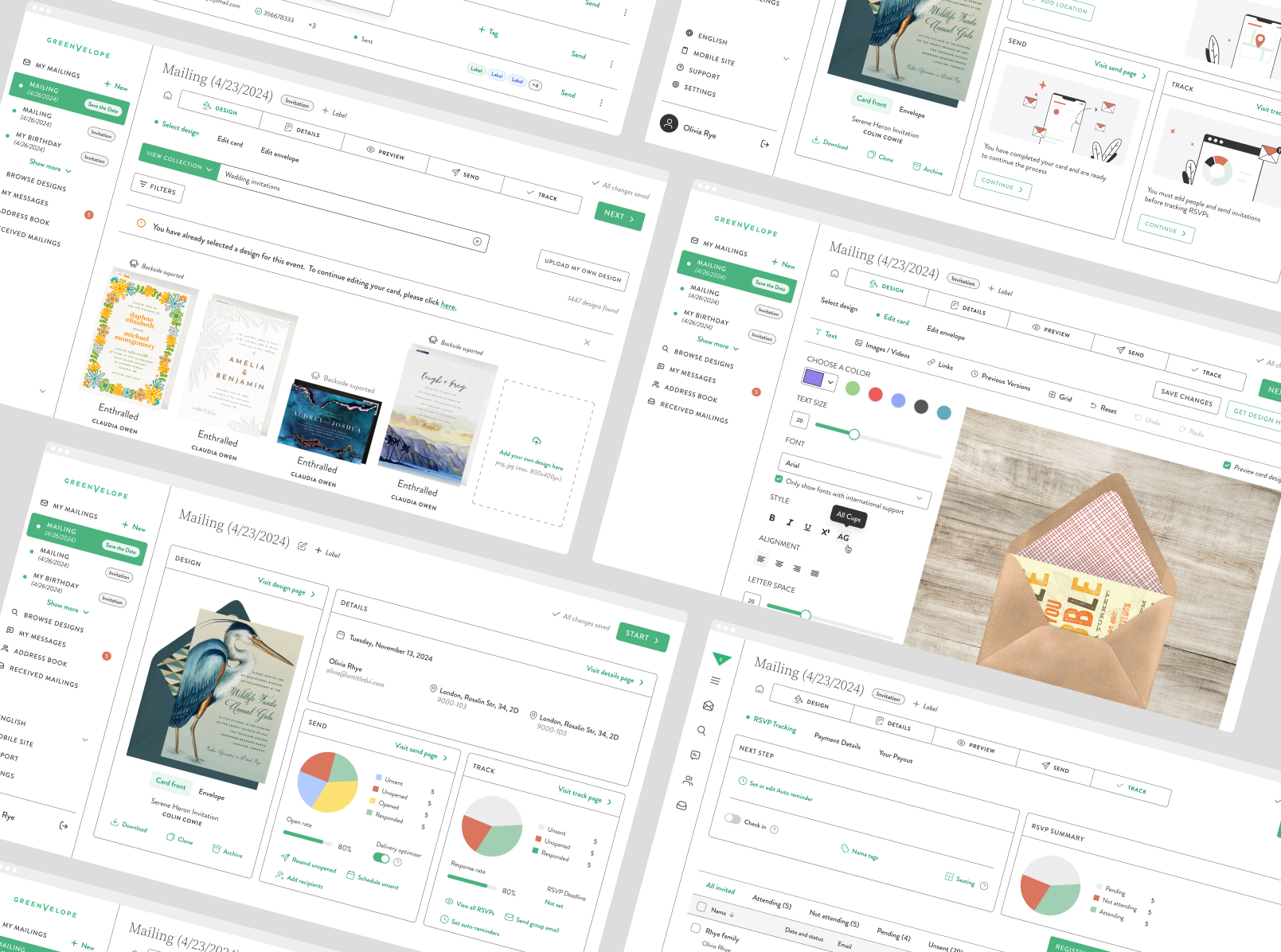
I was involved in redesigning both the website and the web application. The goal was to improve usability, refine the visual style, and introduce new features that aligned with user expectations and event trends. From choosing more elegant typography to reducing the overuse of green accents, the focus was on creating a sophisticated yet accessible experience.
The previous dashboard design had become cluttered and visually heavy, making it hard for users to navigate and focus on key tasks like tracking RSVPs or editing invitations. Important functions like sending reminders or viewing analytics were buried in less intuitive places. The UI lacked visual hierarchy and didn’t reflect the elegance people expect from an invitation experience. Additionally, the strong green accent color overpowered the interface and reduced the focus on invitation content.

We started by simplifying the dashboard layout and reorganizing the content structure to prioritize key actions. I explored different font and color options to create a cleaner, more refined look—replacing the heavy green tones with more balanced neutrals.
To support long-term consistency, we also created a scalable design system in Figma. It includes reusable components like buttons, icons, typography styles, and spacing rules, making it easy for the team to build and maintain future features.
New features were added, including the ability to customize invitations with music and images. I also introduced improvements to the RSVP tracking and follow-up tools, making it easier to resend invites or manage guest responses. The mobile view was designed in parallel to ensure a smooth experience across all devices.
We used Figma for design and prototyping, allowing fast iterations and stakeholder feedback. The result was a more elegant, user-friendly platform that feels modern while preserving the charm and formality of traditional invitations.


.jpg)
After the redesign went live, we tracked how the updated dashboard and UI changes affected user engagement. The results showed clear improvements across key metrics—users were engaging more frequently, staying longer, and completing tasks more easily.
The simplified layout, visual refinements, and improved interaction flow helped users complete their goals faster and with less friction, ultimately making the Greenvelope experience feel more premium and intuitive.

.jpg)