
The task was to create a web app based on an existing mobile app, with the goal of increasing trading volume and improving conversion rates.
User research, wireframing, prototyping, UI design
Built a maintained a design system
Art direction and brand design
Increase user onboarding and trading volume
Decreased design to dev handoff time
Improve swissborg.com conversion rate
For an ordinary person, anything related to crypto trading often feels abstract, complex, and risky.
SwissBorg’s mobile app successfully addresses many of these concerns by focusing on safety and usability. Within the app, users can trade using professional features such as take profit and stop loss, invest in diversified crypto bundles, stake assets, and even participate in launchpads, all within a secure and intuitive environment.
During SwissBorg’s token generation event in 2018, user growth spiked, driven mainly by early adopters and speculative investors. However, once the initial excitement faded, the company faced a new challenge: how to attract and retain everyday users, a challenge that still persists today.
The core issue lay in conversion and sustained engagement. Beyond the hype cycle, few new users were joining, and trading volumes began to stagnate.
To address this, SwissBorg set out to create a complementary web application, an experience designed to support existing mobile users while appealing to new audiences. The goal was to simplify access, increase trading activity, and revive user growth through a more approachable and seamless digital experience.
My design decisions were informed by:
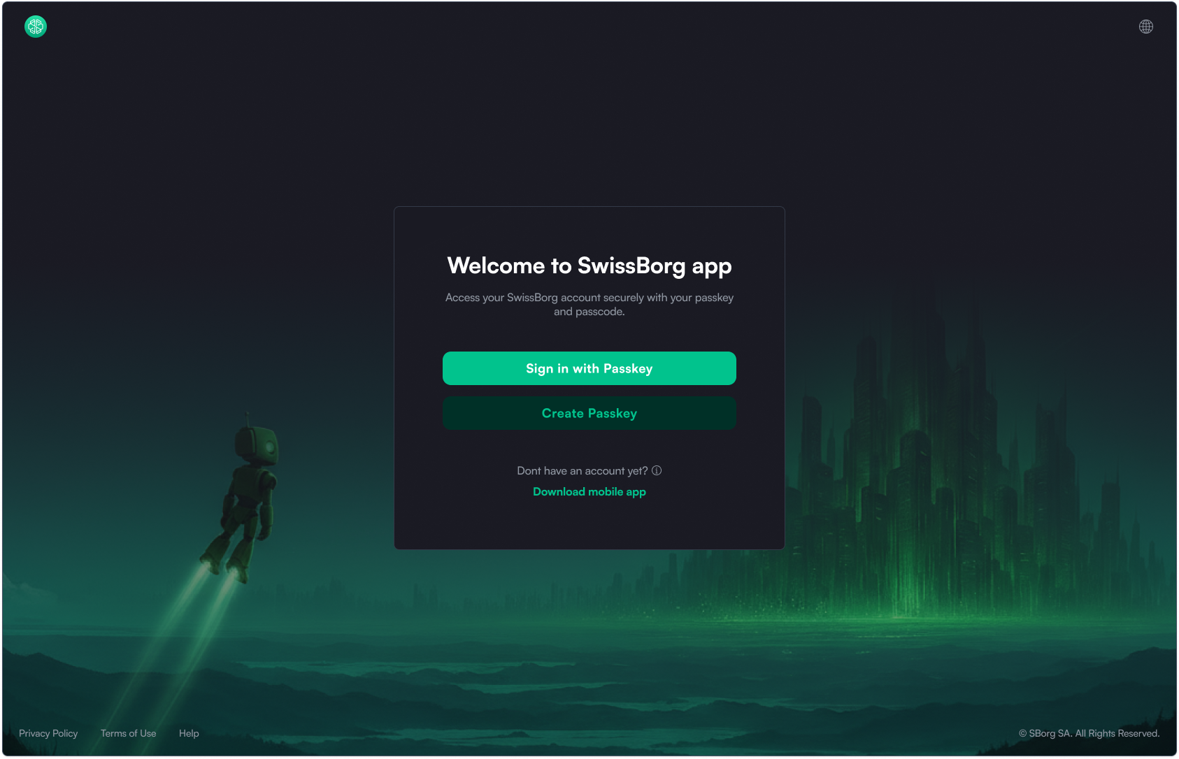
The user journey begins on the homepage (or any marketing page) → then transitions into the web app when the user clicks “Launch App.”
Unlike the common approach, which requires users to sign up before accessing the web app. I allow non-logged-in users to explore the interface first.
This “open preview” model is proven to reduce friction, build trust, and increase conversion.
Most leading exchanges (Binance, Bybit, OKX, KuCoin, Gate, MEXC) follow this approach.
After logging in, users land on the “Today” page - a dashboard designed to drive engagement and encourage daily interaction. I strongly advocated for including this page in the MVP, even though it wasn’t initially part of the discussed scope.
Why it matters:
Although the “Today” page may not have been in SwissBorg’s original MVP plan, I recommended prioritizing it because:
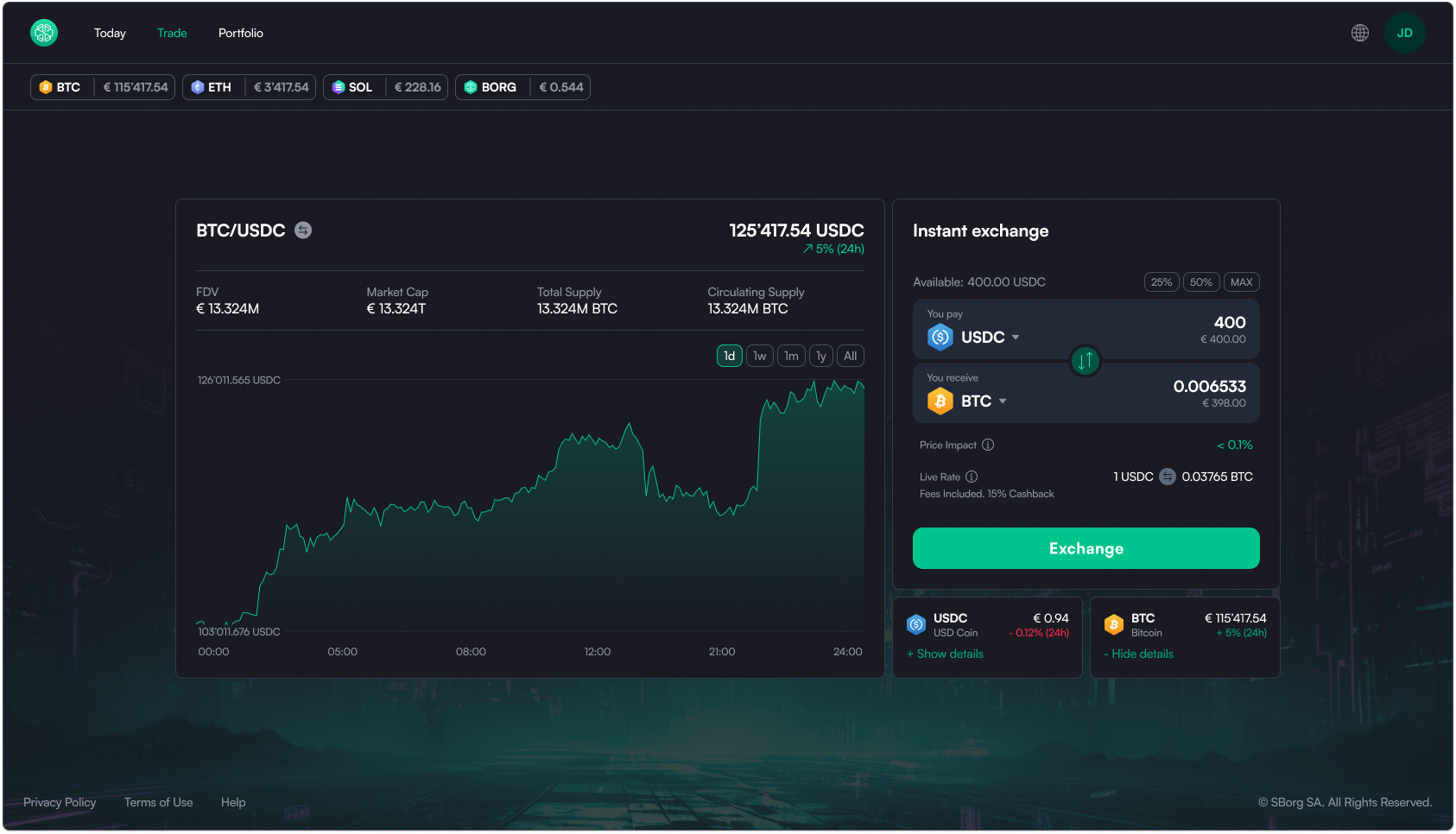
The Trade page includes a swap widget and token details.
By clicking “Show details” beneath the widget, users can access token insights, a lightweight alternative to a full Asset Page, which is not part of the MVP scope.
This approach provides depth without complexity, supporting both new and active traders.
The Portfolio view highlights only the most relevant data upfront.
Based on SwissBorg mobile data, only 1 in 10 users visit the “Allocation” section, so it’s hidden by default to reduce clutter.
I intentionally avoided placing the Swap widget on portfolio page, as suggested by the SB team.
This design choice:
While Kraken uses the “swap everywhere” approach, its low market ranking suggests this pattern doesn’t necessarily improve trading behavior.
Another key discussion is navigation placement.
The SB team favors a sidebar (inspired by Revolut and Kraken), while I chose a top navigation bar, because:
A top bar keeps the layout lighter, scalable, and visually balanced, perfect for an app that will evolve but remain content-focused.
Through this project, I was able to apply a holistic design approach - from user research and wireframing to UI design, design system maintenance, and brand direction to create a web experience that complements SwissBorg’s mobile app and thei marketing website.

.png)

.jpg)
.png)